Landing pages are meant to do one thing–motivate people to take a specific action. However, many landing pages aren’t designed to maximize action and conversions.
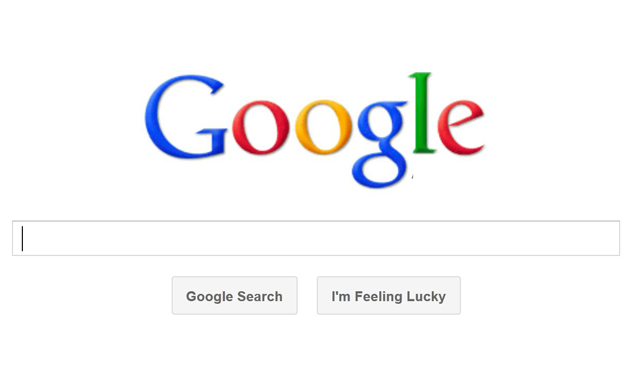
In fact, many businesses and organizations don’t even bother to create landing pages. Instead, they lead all visitors from their online ads, email marketing, and so on to the company’s home page. That’s a big mistake, and it will significantly reduce the number of people who actually complete the specific action the company wanted when it invested time and money into the ad or other marketing campaign that drove the landing page initial visit.
To ensure your landing pages are optimized to achieve maximum results, follow the 10 secrets to a landing page design that converts. By making these simple changes to your landing page design, you’ll see your conversions go up and you’ll be more likely to meet your goals.
1. Stay Laser-focused on One Goal
Any landing page you create should have a single, specific goal. What do you want people who land on this page to do? That should be the only thing talked about on the page, and it should be the only thing visitors can do on the page. Do you want people to subscribe to your newsletter? Buy your product? Sign up for your webinar? Whatever that goal is, it should take center stage all by itself.
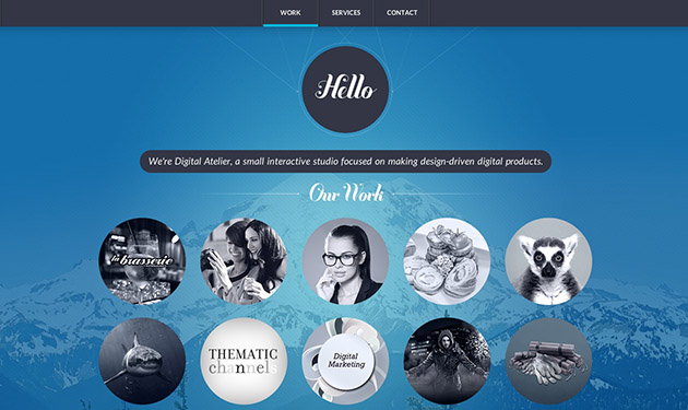
2. Put the Most Important Information Above the Fold
Do not make a visitor scroll in order to learn what you can do for them and how they can get it. In other words, your most important information and call to action should be front and center above the fold. See #4 for more details about calls to action.
3. Create a Clear Headline

Your landing page headline is not the place to try to get cute, creative, or crazy. It’s the place to communicate one of the key elements of good copywriting, “what’s in it for me,” to visitors. Be bold and concise. The headline should make it clear that the visitor has landed on a page where they can get something they want or need.
4. Use a Clear and Repeated Call to Action
Your call to action should be clear and obvious. Make it incredibly easy for visitors to take the action that you want. The call to action should be above the fold. It should also appear throughout the landing page. Your goal should be to ensure that the call to action is always visible, no matter where a visitor is as they scroll down the page.
5. Display Relevant Information and Images Only
Images should enhance your message, not detract from it. With that in mind, delete any images that aren’t directly relevant to your goal. Similarly, all text on your landing page should be useful and meaningful and lead visitors through a narrative of why taking the action you want will help them or satisfy them in some way. If any portion of your landing page copy doesn’t move visitors to that ultimate goal, delete it.
6. Limit Formatting to One-Column and a Lot of White Space
Clutter is a landing page killer. Not only should your landing page content be laser focused, but it should also keep visitors laser focused on a single message. Avoid displaying ancillary navigation bars or extraneous elements on your landing page. Use a single column layout with a lot of white space to break up the text-heavy page. Use headings, subheadings, and bulleted lists to guide visitors through the page.
Research shows that most web page visitors scan through a page’s content before they commit to reading the details. Make sure your landing page headlines and subheadings guide visitors through your message and lead them to follow your call to action.
7. Provide Proof of Your Claims
Don’t just say what you, your business, your product, or service can do for your audience, show them. You can do this on your landing page by providing images and videos showing how your product is used or with messages from you or satisfied customers. Testimonials can also be provided in written text. Always be completely honest and transparent when you publish testimonials and endorsements on your landing page, and be sure to disclose any material connections between you and the individuals providing the endorsements. It’s not only ethical, but it’s also the law.
8. Create an Easy to Complete Form
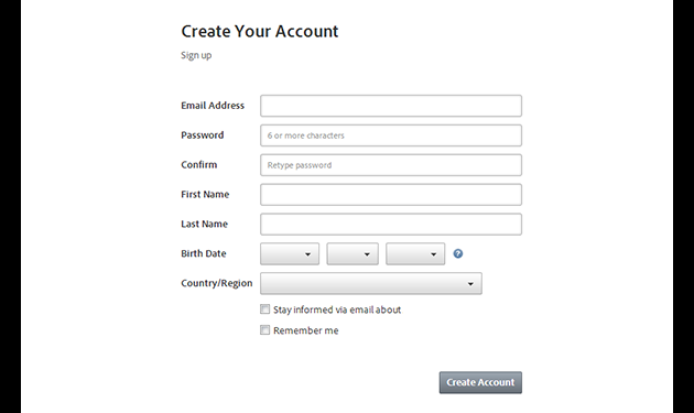
Most landing pages include a form that visitors must complete to get the item or service being offered. Keep the form as simple as possible, and avoid the temptation to collect any information beyond the information you must have to fulfill the specific offer. Not only does this increase the level of trust visitors will feel toward you and your brand, but it also speeds up the form completion process.
If you can, enable auto-complete on your forms so visitors’ whose email addresses, names, and so on are already stored in their web browsers don’t have to retype that information into your form. Instead, the form will already be pre-populated with that information, which can increase conversion rates on your landing page.
9. Include Essential Links Only
Just as you shouldn’t include unnecessary text or images on your landing page, you shouldn’t include extraneous links either. Don’t give visitors the chance to get away from the important messages on your landing page. Only link to critical information that you cannot offer directly within the content of your landing page.
10. Omit Over-the-Top, Too-Good-to-be-True Claims
Consumers don’t trust landing pages with heavy sales pitches. These pages read like infomercials, which consumers learned to distrust years ago. Sales language is important, but don’t over-promise. Use proof to back up your most compelling claims as explained in #7 above, but don’t inadvertently destroy the level of trust with visitors by pushing too hard with over-the-top messaging.